
A modern restyle that brought Kiwi +90 demos after launch


We restyled a fintech for underbanked Latinos in the U.S. and gave its new business lines a clear place to grow
Kiwi is a fintech that helps underbanked Latinos in Puerto Rico and the U.S. access responsible credit and build their credit history.
More than 300,000 people trust Kiwi, managing personal loans, Kiwi Pay and Credit Builder 100% from their phone.
We have worked with Kiwi since February 2026 through our Transform service, designing and building its site in Webflow.
The problem
Kiwi was growing faster than its website. New business lines were on the way, but the site still spoke for a single product, with a visual style that had fallen behind the trust Kiwi had earned with more than 300,000 people. To reach a community often overlooked by traditional banks, the brand needed to look as modern and reliable as the product behind it.

Here's what we found:
A dated look. The visual style had fallen behind newer fintechs, making a trusted product feel less current than it really was.
No room for what came next. Kiwi Pay and Credit Builder needed a clear place on the site, next to the loans users already knew.
A brand missing its character. Kiwi wanted to bring its Kiwi mascot into the brand, but the old style had no space for it.
One market, more on the way. The site had to serve Puerto Rico today and scale to Florida, Texas, Utah and Missouri next.
Modern enough to stand out, clear enough to trust
A restyled Kiwi, with one visual system for every product and a character that makes credit feel closer.


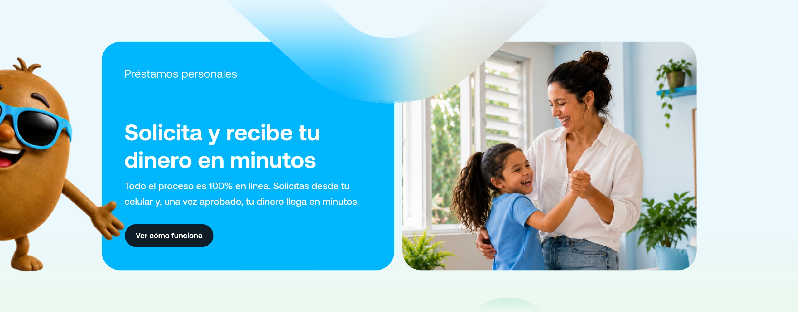
We unified Kiwi’s entire visual style under one modern design system, built for a community that has often been left out of traditional finance. A fresh palette, warm photography of real people and custom product cards gave the brand a more current, confident look, while the Kiwi character became part of the experience, adding personality and closeness to every page.
The new system also gave each business line its own space. Personal loans, Kiwi Pay and Credit Builder now live under one navigation, each with a clear message and its own path to apply. We built the site in Webflow with Advanced Localization in English and Spanish, and designed transactional landings like Personal Loans for Puerto Rico, ready for SEO and paid traffic and structured to scale to new states.


The impact
The restyle launched with a clear message for the market: Kiwi is more than a loan. With every business line visible and a brand that finally looked as modern as its product, interest came fast, and Kiwi booked more than 90 demos after launch.
The new structure also changed how fast the team can move. Reusing the same components, the Personal Loans landing for Puerto Rico went from sign-off to delivery in two weeks, ready to be adapted to each new market and language.
+90
Demos booked after launch
3
Business lines unified under one design system
2
Languages, English and Spanish, with Advanced Localization
5
Markets the structure is ready for: PR, FL, TX, UT and MO
